Cartopy has exposed an interface to enable easy map creation using matplotlib. Creating a basic map is as simple as telling matplotlib to use a specific map projection, and then adding some coastlines to the axes:
import cartopy.crs as ccrs
import matplotlib.pyplot as plt

ax = plt.axes(projection=ccrs.PlateCarree())
ax.coastlines()

plt.show()
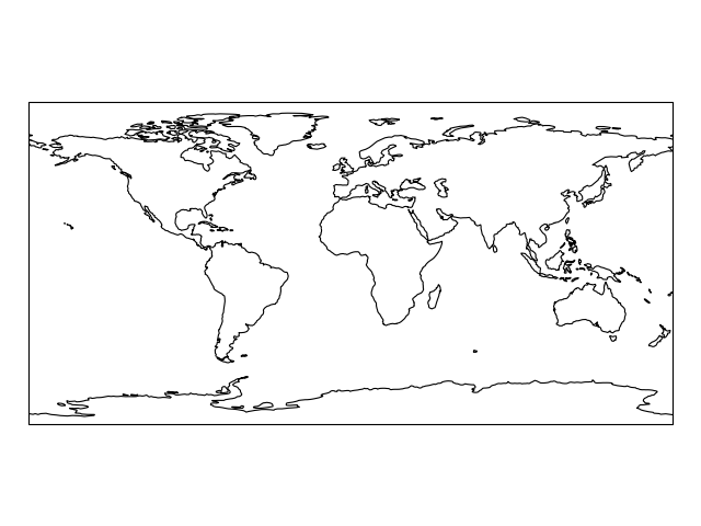
A list of the available projections to be used with matplotlib can be found on the Cartopy projection list page.
The line plt.axes(projection=ccrs.PlateCarree()) sets up a GeoAxes instance which exposes a variety of other map related methods, in the case of the previous example, we used the coastlines() method to add coastlines to the map.
Lets create another map in a different projection, and make use of the stock_img() method to add an underlay image to the map:
import cartopy.crs as ccrs
import matplotlib.pyplot as plt

ax = plt.axes(projection=ccrs.Mollweide())
ax.stock_img()
plt.show()
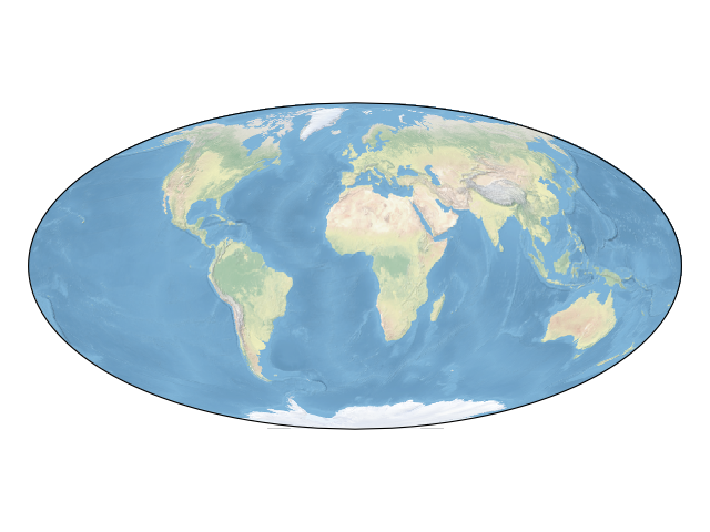
At this point, have a go at picking your own projection and creating a map with an image underlay with coastlines over the top.
Once you have the map just the way you want it, data can be added to it in exactly the same way as with normal matplotlib axes. By default, the coordinate system of any data added to a GeoAxes is the same as the coordinate system of the GeoAxes itself, to control which coordinate system that the given data is in, you can add the transform keyword with an appropriate cartopy.crs.CRS instance:
import cartopy.crs as ccrs
import matplotlib.pyplot as plt

ax = plt.axes(projection=ccrs.PlateCarree())
ax.stock_img()

ny_lon, ny_lat = -75, 43
delhi_lon, delhi_lat = 77.23, 28.61

plt.plot([ny_lon, delhi_lon], [ny_lat, delhi_lat],
         color='blue', linewidth=2, marker='o',
         transform=ccrs.Geodetic(),
         )

plt.plot([ny_lon, delhi_lon], [ny_lat, delhi_lat],
         color='gray', linestyle='--',
         transform=ccrs.PlateCarree(),
         )

plt.text(ny_lon - 3, ny_lat - 12, 'New York',
         horizontalalignment='right',
         transform=ccrs.Geodetic())

plt.text(delhi_lon + 3, delhi_lat - 12, 'Delhi',
         horizontalalignment='left',
         transform=ccrs.Geodetic())

plt.show()
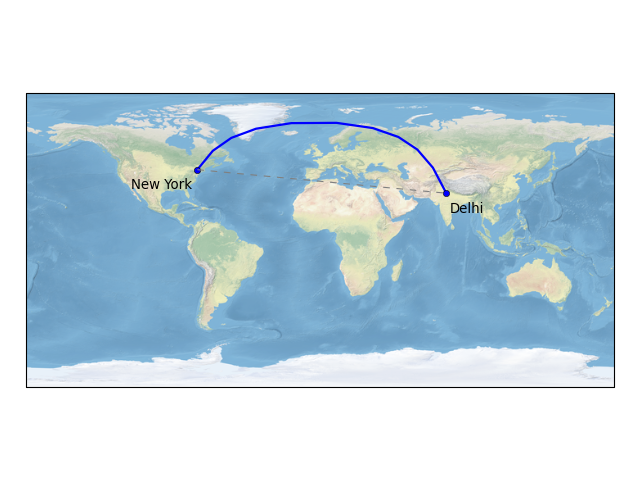
Notice how the line in blue between New York and Delhi is not straight on a flat PlateCarree map, this is because the Geodetic coordinate system is a truly spherical coordinate system, where a line between two points is defined as the shortest path between those points on the globe rather than 2d Cartesian space.
Note
By default, matplotlib automatically sets the limits of your Axes based on the data that you plot. Because cartopy implements a GeoAxes class, this equates to the limits of the resulting map. Sometimes this autoscaling is a desirable feature and other times it is not.
To set the extents of a cartopy GeoAxes, there are several convenient options:
- For “global” plots, use the set_global() method.
- To set the extents of the map based on a bounding box, in any coordinate system, use the set_extent() method.
- Alternatively, the standard limit setting methods can be used in the GeoAxes’s native coordinate system (e.g. set_xlim() and set_ylim()).
In the next section, examples of contouring, block plotting and adding geo-located images are provided for more advanced map based visualisations.