Note
Click here to download the full example code
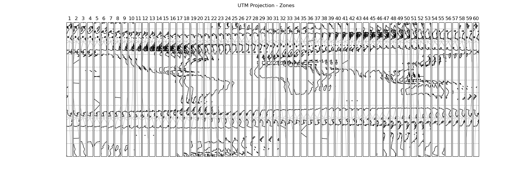
Displaying all 60 zones of the UTM projection#
This example displays all 60 zones of the Universal Transverse Mercator projection next to each other in a figure.
First we create a figure with 60 subplots in one row. Next we set the projection of each axis in the figure to a specific UTM zone. Then we add coastlines, gridlines and the number of the zone. Finally we add a supertitle and display the figure.
import cartopy.crs as ccrs
import matplotlib.pyplot as plt


def main():
    # Create a list of integers from 1 - 60
    zones = range(1, 61)

    # Create a figure
    fig = plt.figure(figsize=(18, 6))

    # Loop through each zone in the list
    for zone in zones:

        # Add GeoAxes object with specific UTM zone projection to the figure
        ax = fig.add_subplot(1, len(zones), zone,
                             projection=ccrs.UTM(zone=zone,
                                                 southern_hemisphere=True))

        # Add coastlines, gridlines and zone number for the subplot
        ax.coastlines(resolution='110m')
        ax.gridlines()
        ax.set_title(zone)

    # Add a supertitle for the figure
    fig.suptitle("UTM Projection - Zones")

    # Display the figure
    plt.show()


if __name__ == '__main__':
    main()
Total running time of the script: ( 0 minutes 38.711 seconds)